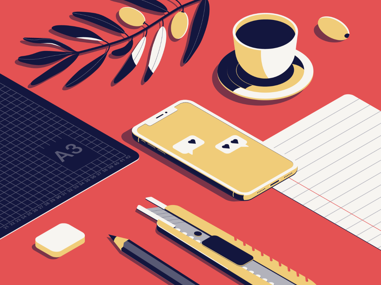
Isometric Design in the Wild
B2B doesn’t have to be boring.
It just usually is.
In a landscape flooded with copycat websites, templated product pages, and stock visuals, innovative brands are rediscovering the power of design; not just as decoration, but as a communication tool. Visual storytelling is finally catching up to the complexity of the products and ideas it’s meant to convey.
Let’s talk about dimensionality in how ideas are presented.
In Short:
Why Isometric Design Is Trending
Visual Depth Without Complexity: Isometric illustrations create a 3D effect in a 2D space, adding dimensionality without the overhead of full 3D rendering.
Clean, Professional Look: It strikes a balance between minimalism and detail, making it ideal for fintech, SaaS, and analytics platforms.
Storytelling Power: Designers use isometric scenes to visually explain workflows, ecosystems, or product features in a way that feels intuitive and engaging.
Where It’s Being Used
Landing Pages: Especially for startups and digital services, where isometric illustrations help convey abstract concepts like cloud infrastructure or data flow.
Dashboards & UI: Some platforms use isometric icons and micro-illustrations to add polish and hierarchy to their interfaces.
Marketing Sites: Brands like Klaim.ai and PaxFamilia have used isometric design to build trust and communicate complexity with clarity
The Rise (and Maturation) of Isometric and 3D-Lite Design
Isometric illustration, once a trendy upgrade to flat design, is now part of a broader creative toolkit that includes:
3D-style iconography
Micro-interactions and motion graphics
Custom illustrations that simplify complex systems
Interactive product visualizations on scroll
Modern B2B brands are embracing design systems that enable users to quickly understand what they do and feel a sense of accomplishment while doing it. That’s especially important when your product isn’t inherently visual, like cybersecurity, data analytics, or workflow automation.
Why Dimensional Design Still Works
Done right, 3D-inspired and isometric elements:
Add detail without clutter
Guide the eye to actions and next steps
Simplify the complex (think: data flows, system architecture, layered services)
Boost comprehension and retention, especially for visual learners
And frankly, they make things feel human again in a sea of sameness
At Gn5, we’ve seen dimensional design succeed most on:
Landing pages that support product launches or explainers
Infographics and sales assets that condense multi-step processes
Hero sections that need to show value at a glance
Interactive case studies where story flow matters
But Don’t Overdo It
A flat design still has its place, especially on mobile, where load time and responsiveness can trump visual ambition. Good design is about contrast and control, not applying trends across every surface.
That’s why we approach visual direction like we do campaign strategy:
What’s the job of this piece? What do we want people to feel, understand, and do?
From there, we select the best design language to support the message, not the other way around.
The Bigger Picture
You don’t need an entirely isometric website to make a statement. Sometimes, a single well-designed asset or interactive module conveys more meaning than a dozen flat icons could ever do.
Choherence over aesthetic. A visual system that brings clarity to complexity. A creative layer that turns function into emotion. A brand experience that actually rewards attention.
Need help building visual systems that clarify, convert, and cut through?
Gn5 blends creative direction with strategic storytelling, so you don’t just look better. You land better.


